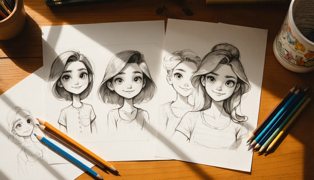
To age a character up or down, adjust your head-to-body ratio first — infants get larger heads, adults get smaller ones. Move facial features lower and cluster them for youth; shift them higher and wider for maturity. Add wrinkles along natural folds, gray or thin the hair, and modify posture to reinforce the age. Each detail you layer in builds a stronger, more believable read — and there’s much more to master.
Key Takeaways
- Adjust head-to-body ratio; children have larger heads relative to their bodies, while adults follow a one-seventh or one-eighth ratio.
- Place eyes lower with larger sizing for youth; shift features higher and outward to convey maturity.
- Add wrinkles strategically along natural facial folds, starting with crow’s feet and nasolabial folds for subtle aging effects.
- Use hair changes like graying, thinning, or recession to signal aging, while fine strands suggest infancy or youth.
- Select clothing styles, colors, and accessories appropriate to the age group to reinforce a character’s perceived age.
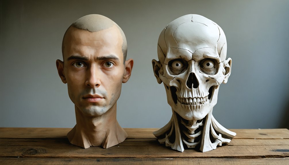
Draw the Right Head-to-Body Ratio for Every Age
Head-to-body ratio is one of the most powerful tools you’ll use to establish a character’s age at a glance. Head size relative to total height communicates age faster than any other visual cue.
Head-to-body ratio is your fastest tool for communicating a character’s age before any other detail lands.
For infant proportions, the head occupies roughly one-third to one-fourth of total height. As you scale upward toward adult dimensions, that ratio shifts to approximately one-seventh or one-eighth.
Apply these height ratio guidelines consistently across your roster to maintain design consistency and avoid age ambiguity. Character scaling errors—like giving a child adult-sized limbs—immediately break age representation.
Use a simple construction grid to lock in proportions before detailing. Treating head-to-body ratio as a foundational rule rather than an afterthought keeps every character visually grounded and immediately readable across any age range.
Adjust Body Shape and Posture to Match Your Character’s Age
Once you’ve locked in proportions, body shape and posture become your next tools for reinforcing age. Children carry rounder, softer body proportion with minimal muscle definition and short limbs.
As characters mature, contours sharpen, mass distributes more deliberately, and stances grow sturdier.
For middle-aged characters, add subtle weight shifts around the midsection and introduce a more grounded, serious posture.
Older characters benefit from hunched backs, forward-leaning posture cues, and slightly reduced overall mass. These shifts signal physical wear without relying solely on facial detail.
Don’t overlook posture as a storytelling device. A slouched spine, dropped shoulders, or a forward lean communicates decades of life instantly.
Pair intentional body proportion choices with deliberate posture cues to build age that reads clearly across any art style.
Place Facial Features to Signal Age Immediately
When designing a character’s face, you’ll want to place the eyes lower on the face to signal youth, since larger eyes set near the midpoint of the head instantly read as childlike.
As your character ages, shift the eyes higher and closer to the brows, tightening the overall feature spacing to communicate maturity.
These placement decisions work faster than any texture or wrinkle detail, giving viewers an immediate age read at a glance.
Eye Placement Reveals Age
Eye placement alone can signal a character’s age before any other detail registers. For younger characters, increase eye size and drop them lower on the face, which naturally raises feature density in the upper half. This lower positioning creates that signature wide-eyed, open look.
As you age a character up, shift the eyes higher toward the eyebrows, tightening the space between them and the brow line. Adjust the eyelid fold to rest lower on older characters, partially obscuring the iris color and reducing sclera visibility.
Eye shape itself stays consistent, but that drooping top lid communicates years instantly. You can also redirect gaze direction subtly downward in elderly designs to reinforce a weighted, world-worn posture that supports your overall aging strategy.
Feature Spacing Signals Youth
Facial feature spacing communicates age faster than wrinkles or hair color ever will. When you compress feature arrangement toward the face’s center and lower half, you instantly signal youth.
Children’s faces carry facial compactness by design — eyes sit low, noses stay short, and mouths cluster near the chin.
Prioritize eye size first. Larger eyes with more space between the lower lid and nose bridge push your character younger immediately.
As you age a design up, expand that vertical distance, shrink eye size, and spread features toward the face’s outer edges.
Think of youthful proportions as a tight cluster occupying roughly the bottom third of the face.
Shift that cluster upward and outward, and maturity follows automatically — no wrinkles required.
Add Wrinkles and Skin Texture Without Overdoing It
Wrinkles define volume rather than simply mark age, so you’ll want to place them where the skin folds naturally—around the eyes, mouth, and forehead.
Prioritize wrinkle placement based on facial structure, not arbitrary lines. Controlled skin depth creates realism without cluttering your design.
Follow these core techniques:
- Layer shading first — Use a “Multiple” blending mode with reduced opacity before committing to linework, establishing skin depth subtly.
- Start minimal — Add crow’s feet and nasolabial folds first; only introduce forehead or neck creases for advanced aging stages.
- Use contour logic — Draw wrinkles along natural bone and muscle movement paths, not randomly across flat surfaces.
Less linework with strategic placement communicates age more effectively than dense, overworked texturing ever will.
Use Hair and Facial Hair to Establish Age at a Glance
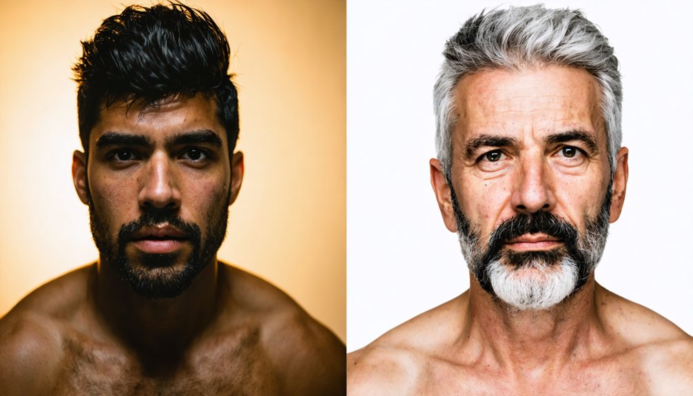
Hair communicates age faster than almost any other visual element, so you’ll want to use it deliberately. Different hair types signal life stages instantly—fine, wispy strands suggest infancy, while coarse or thinning textures indicate maturity.
Adjust hair length and hairstyle variations to reinforce your character’s decade: cropped, styled cuts read as young adulthood, whereas receding or sparse arrangements push toward older age.
Beard styles function as powerful aging indicators for male characters. Clean-shaven reads young; a five o’clock shadow suggests early adulthood; full beards or unkempt facial hair implies middle age or beyond.
Color choices accelerate this read—introduce gray roots before committing to full silver strands. Grooming habits also shape perception, since polished styling feels youthful while disheveled or thinning hair reshapes the character silhouette toward advanced age.
Apply Color and Shading to Deepen Age Realism
Color and shading do the heavy lifting when texture alone isn’t enough to sell a character’s age. Applying smart color theory and shading techniques lets you push realism without overworking your linework.
Use these three approaches to maximize impact:
- Set your shading layer to “Multiple” blending mode — it deepens facial contours and naturally communicates aged skin without heavy inking.
- Choose desaturated, warm, or cool tones at reduced opacity — avoid pure gray or black, which flatten the face instead of sculpting it.
- Add sparse vein details at bone joints — draw them with contour-following lines to suggest thinning skin convincingly.
Each technique compounds the other. Together, they create a cohesive read of age that feels grounded in structure rather than decoration.
Avoid the Proportion and Detail Mistakes That Flatten Age Reads
Proportion errors undermine age reads faster than any missing wrinkle will. If you’re aging a character up but keep a 1/4 head-to-body ratio, youthful features override every texture detail you add.
Proportion errors kill age reads before a single wrinkle gets the chance to matter.
Conversely, shrinking the eyes without repositioning them higher on the face creates detail flattening that stalls age perception entirely.
Watch these specific proportion mistakes: eyes sitting too low signal youth regardless of added crow’s feet, and oversized heads paired with mature wrinkles produce visual contradiction.
Jaw length must shorten for younger reads; leaving it adult-length kills believability.
Don’t rely on surface detail alone to carry age. Structure drives the read first. Lock proportions correctly before adding wrinkles, and your aging work compounds rather than cancels itself out.
Frequently Asked Questions
Can Aging Techniques Differ Between Realistic and Cartoon Character Styles?
Yes, aging techniques differ greatly. In realistic styles, you’ll apply subtle wrinkles, skin flaccidity, and realistic details. In cartoons, you’ll lean on cartoon exaggeration—oversized features, bold creases, and amplified proportions to convey age instantly.
How Do Cultural Backgrounds Influence Age Representation in Character Design?
You’ll find cultural symbolism shapes how you depict age—Eastern designs often honor elders with dignified postures, while Western styles lean on age stereotypes like wrinkles for comedy. Adjust visual cues to authentically reflect your character’s cultural context.
Should Clothing Choices Reflect a Character’s Age Alongside Physical Features?
Yes, you should align clothing styles with physical features to reinforce age symbolism. Layer conservative cuts for elders, bold patterns for youth, and structured silhouettes for middle age—you’ll instantly communicate a character’s life stage visually.
How Does Lighting Affect the Perception of a Character’s Age?
You’ll find that shadows impact perceived age dramatically—harsh, directional light deepens wrinkles while soft, diffused light minimizes them. Cool color temperature adds years; warm tones subtract them, giving you precise control over aging.
Can Voice or Sound Design Reinforce Aging Visuals in Animated Characters?
Studies show 38% of perception comes from vocal tone. You can reinforce aging visuals by pairing voice modulation—deeper or raspier tones—with sound effects like labored breathing, making your character’s age instantly convincing.
References
- https://tips.clip-studio.com/en-us/articles/7045
- https://www.youtube.com/watch?v=UKagvn9VK7I
- https://bardotbrush.com/how-to-draw-a-character-at-different-ages/
- https://tips.clip-studio.com/en-us/articles/7050
- https://www.youtube.com/watch?v=lQJCfPJc4g4
- https://www.youtube.com/watch?v=LFb3LOSSYtk
- https://tips.clip-studio.com/en-us/articles/7042
- https://www.castingnetworks.com/news/age-and-acting-how-to-age-yourself-up-or-down-for-a-role/
- https://www.deviantart.com/wickfield/art/How-to-Age-Your-Characters-Tutorial-644327103
- https://www.facebook.com/21draw/posts/tip-for-aging-charactersa-simple-way-you-can-age-your-characters-over-time-is-by/1819370454917056/