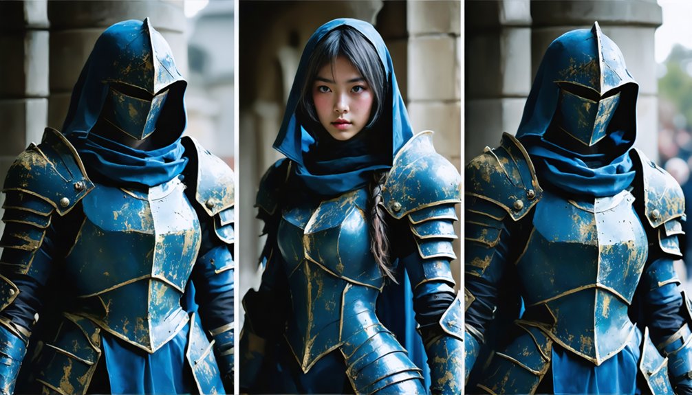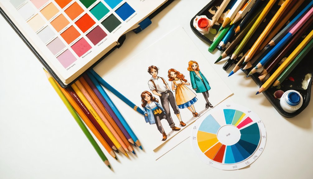
Matching character colors accurately requires starting with a limited palette built around a 60-30-10 split. You’ll want to align hues with your character’s emotional tone before refining saturation and value contrast. Test your palette in grayscale to confirm shapes separate clearly, and always check colors against varied backgrounds. Calibrate your monitor consistently and export test versions across multiple displays. Master these fundamentals, and the deeper techniques ahead will sharpen your results considerably.
Key Takeaways
- Start with a limited palette of three colors in a 60-30-10 split to create intentional, balanced character color matching.
- Test your character against light, dark, and midtone backgrounds to identify and fix contrast or silhouette issues.
- Calibrate your monitor regularly to ensure colors appear consistent and accurate across different devices and displays.
- Control saturation carefully, reserving high saturation for accents while keeping large areas muted for visual clarity.
- Make subtle, incremental color adjustments and track each change to maintain harmony and avoid unintended palette disruption.
Start With a Limited Color Palette
When building a character palette, fewer colors almost always produce stronger results. Restricting your hues forces intentional decision-making and prevents visual noise that weakens legibility, particularly in thumbnail-scale environments.
Fewer colors, stronger results. Restriction forces intention and eliminates the visual noise that quietly destroys legibility.
Structure your palette around one dominant color, one secondary color, and one accent color, then apply a 60-30-10 split to control hierarchy precisely.
Reference a color wheel early in your process to identify relationships between chosen hues. Complementary schemes deliver strong contrast and immediate visual clarity, making them especially effective for characters requiring high readability across varied backgrounds.
Avoid introducing additional hues until your three-color foundation is fully resolved.
Test your palette in grayscale frequently. If shapes separate clearly without color information, your value structure is sound and your limited palette is working correctly.
Align Your Character’s Colors With the Right Mood
Color communicates character before shape does, so your palette needs to carry emotional tone from the first glance. Color psychology gives you a systematic framework for encoding personality directly into your design decisions.
Warm hues signal energy, friendliness, and approachability, while cool hues project calm, distance, or authority. Dark values suggest mystery or threat; light values read as gentle or optimistic.
Start by defining your character’s core role and emotional intent before selecting a single hue. Then build your palette outward from that identity anchor.
A villain shouldn’t accidentally read warm and inviting because you chose the wrong accent color. Every hue, value, and saturation level should reinforce the same narrative signal, ensuring your character communicates its intended emotional tone instantly and precisely.
Choose a Color Harmony That Fits Your Character’s Energy
Once you’ve locked in your character’s emotional tone, the next decision is structural: which color harmony will organize your palette. Each harmony system produces a distinct visual tension level, so your choice directly shapes how the character reads energetically.
Complementary schemes place opposing hues against each other, generating maximum contrast and visual intensity. They work well for high-stakes, combative, or dramatically charged characters where tension is intentional.
Analogous harmony groups neighboring hues together, producing softer gradations and a unified, cohesive feel. It suits grounded, calm, or narratively subtle characters without sacrificing palette sophistication.
Triadic arrangements split the wheel into three equidistant points, delivering vibrant balance that supports energetic or eccentric personalities.
Match the harmony to the character’s core energy first, then refine saturation and value within that structure.
Keep Saturation Balanced Across Your Character’s Palette
Locking in a color harmony gives your palette its structural skeleton, but saturation determines whether that structure feels cohesive or chaotic. Without saturation consistency, even a well-chosen harmony fractures into visual noise.
Apply these principles to maintain color balance:
- Match saturation levels across related color areas so no single zone dominates unintentionally.
- Reserve high-saturation values for accent colors only, placing them against quieter, lower-saturation surroundings to maximize focal impact.
- Reduce saturation in large areas like base clothing or skin to prevent the design from feeling visually aggressive.
- Test in grayscale to confirm that saturation differences aren’t masking weak value contrast.
- Adjust incrementally, since small saturation shifts produce significant perceptual changes across the full character design.
Consistent saturation control transforms a technically correct harmony into a palette that reads with professional clarity.
Use Value Contrast to Separate Your Character’s Colors
Saturation balance keeps your palette cohesive, but it can’t carry the full structural load on its own. Value contrast handles shape differentiation by creating clear boundaries between adjacent color areas, even when hues sit close together on the wheel. Convert your design to grayscale and examine whether each region reads as a distinct form. If shapes merge, you’ve identified a value conflict requiring immediate correction.
Adjust one color’s lightness upward or downward until separation becomes unambiguous. Strong color contrast between light and dark zones defines your character’s primary silhouette and guides the viewer’s eye across the composition efficiently. Reserve your darkest values for anchoring shadows and your lightest for focal highlights.
This value architecture guarantees structural legibility remains intact regardless of background complexity or display size.
Test Your Character’s Colors Against Different Backgrounds
Place your character against light, dark, and midtone backgrounds to expose palette problems that a neutral canvas conceals.
Check whether the silhouette holds its shape and contrast across each background shift, since a palette that reads clearly on white may dissolve against a busy or dark environment.
Use these tests to identify which colors need a value or saturation adjustment before you finalize the design.
Background Contrast Reveals Issues
When you test your character against different backgrounds, contrast issues that weren’t visible on a neutral canvas become immediately apparent. A character reading clearly on white may dissolve against light environments, while dark backgrounds can swallow low-value shadow areas entirely.
Color temperature mismatches surface during this testing phase. Warm-toned characters placed against warm backgrounds lose edge sharpness, causing silhouette boundaries to blur and reducing overall legibility. Switching to a cool background immediately clarifies which edges need value or hue adjustments.
Test across at least three background types: neutral gray, dark, and saturated. Each reveals different weaknesses. Use these findings to refine specific color areas rather than rebuilding the entire palette, targeting only the zones where contrast breaks down under varied environmental conditions.
Silhouette Visibility Across Backgrounds
Identifying contrast issues is only half the work—your character’s silhouette must hold its shape across every background it’s likely to appear against, not just the ones that flatter it.
Test silhouette clarity by placing your character over dark, light, midtone, and saturated backgrounds systematically. Where the form dissolves, apply outline techniques like rim lighting, value shifts at the edge, or a dedicated outline layer to restore separation.
Don’t rely on a single outline weight; adjust thickness and contrast based on each background’s luminosity. A character that reads cleanly against a white background may completely merge into a dark scene.
Consistent silhouette clarity across varied environments signals a palette that’s structurally sound, not just visually appealing under controlled conditions.
Adjust Colors After Testing
Testing your character’s colors against different backgrounds reveals mismatches that aren’t visible in isolation. Once you’ve identified problem areas, adjust specific values rather than rebuilding your entire palette.
Target the colors that merge with backgrounds or lose contrast first, since fixing those directly strengthens overall readability.
Color calibration matters here. Small shifts in hue, lightness, or saturation can resolve edge blending without disrupting your palette’s harmony. Adjust one variable at a time so you track exactly what each change does.
Digital display calibration also affects how others see your final result. What reads correctly on your monitor may shift on uncalibrated screens. Export test versions, check them across multiple displays, and refine accordingly.
Repeated comparison cycles produce more accurate results than single-pass corrections.
Frequently Asked Questions
How Do Cultural Associations With Color Affect Character Design Choices?
Cultural symbolism shapes your design decisions directly. You’ll leverage color psychology to avoid misreadings — purposefully picking palettes that resonate across regions. Carefully consider cultural context, ensuring colors communicate your character’s intended meaning with precision and innovative intentionality.
Should Character Colors Change Between Different Animation or Rendering Styles?
Yes, you should adapt your colors to each rendering style while maintaining color consistency. Stylistic variations in lighting and shading shift how hues read, so you’ll need to recalibrate saturation and value accordingly.
Can Colorblind Players Still Distinguish Characters With Standard Palettes?
Standard palettes often fail colorblind players, so you can’t rely on hue alone. Prioritize value contrast and universal color schemes to guarantee colorblind accessibility, letting players distinguish characters through lightness differences rather than color differentiation.
How Does Lighting in a Game Environment Alter Perceived Character Colors?
Game lighting obliterates your carefully crafted palette instantly. Warm environments shift your character’s hues yellow-orange, while cool scenes push them blue. You’ll notice shadow effects deepening saturation dramatically, and color temperature transforms every carefully chosen tone beyond recognition.
Do Character Colors Need Updating When Porting Across Different Display Screens?
Yes, you’ll need to revisit color calibration when porting across platforms, since display technology varies considerably between OLED, LCD, and HDR screens, causing your character’s saturation and value relationships to shift unexpectedly.
References
- https://www.reddit.com/r/gamedev/comments/lxgt5i/how_to_pick_color_scheme_for_a_character/
- https://dreamfarmstudios.com/blog/color-theory-for-character-design/
- https://toyhou.se/~forums/10502.creator-s-corner/554364.how-do-you-color-your-character-designs
- https://designerup.co/blog/how-to-pick-perfect-color-palettes-every-eime-no-plugins-or-color-generators/
- https://www.youtube.com/watch?v=1GxN_h4U8DU&vl=en
- https://www.youtube.com/watch?v=FX-0SfPxTk4
- https://www.youtube.com/watch?v=f0pZCvru7Ts
- https://pixflow.net/blog/the-ultimate-guide-to-creating-memorable-character-color-palettes/
- https://www.youtube.com/watch?v=hUomxQGSc68
- https://tips.clip-studio.com/en-us/articles/6740